Courtesy of Jeremy Hindle

Reading the description for Severance, a show about a workplace where — thanks to a surgical procedure that severs the connection between work and personal life — its employees forget all about life outside the office for the duration of the workday, one could imagine an environment as mundane as Dunder Mifflin. But when production designer Jeremy Hindle got his hands on Dan Erickson’s high-concept script, he saw something much more interesting. “I think it’s really 2001: A Space Odyssey as an office,” he says.
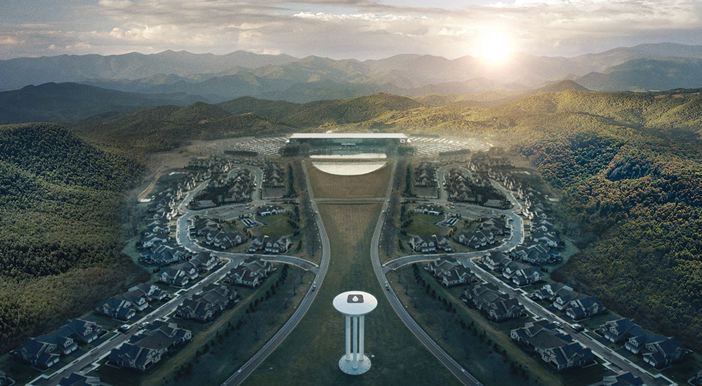
Before meeting with the project’s director and executive producer Ben Stiller, Hindle created an extensive look book. Unbeknownst to him, both he and Stiller had envisioned the architectural style of Eero Saarinen and interior designer Kevin Roche as inspiration for the production design. Together, they landed on the Bell Labs Holmdel Complex, designed by Saarinen and Roche, as their location for Lumon Industries’ exterior, lobby and atrium. “There’s just a precision to the aesthetic,” says Hindle. “Ben loves for everything to be really graphic, and it lends itself to his style.”
The interiors, based on Erickson’s idea that Lumon headquarters reach miles belowground, was built on soundstages that kept increasing in number as the scope of the show grew. “Originally, I think they only had two stages,” says Hindle. “The show was a lot bigger than they’d imagined it to be. We needed more stages and more stages.”

Courtesy of Jeremy Hindle
At York Studios in the Bronx, Hindle built a never-ending maze of hallways that change subtly in width as they progress (Hindle tested 26 shades of white to nail the color of the walls) as well as the simultaneously vast and claustrophobic office space, the so-called MDR room, that Hindle says set the tone for the entire show. “It’s a very unnatural design. Every background in this room is interesting because it’s asymmetric. It’s like you’re playing with their brains,” he says. At the same time, he notes, “there’s something really comfortable about the spaces. Even though it’s creepy, you kind of want to be there.” The Roche-inspired desk in the middle of the MDR room is Hindle’s pièce de résistance. “I wanted a desk that was on one center pillar, so it feels like an umbilical cord to the underground. I also wanted to make it interactive. They could raise the dividers and lower them for shots, to create interesting eyelines,” he says.

Courtesy of Apple TV+
While Severance, which required four concept artists to design everything from Lumon logos to vending machines, is Hindle’s most collaborative project to date, it wasn’t until the series was completed that he had his colleagues convinced that their vision would work. “It was really trying to get everyone in the show — every producer, everyone in my department — to understand that this is going to be different. Most people fall to what they know, and I’m like, ‘There’s nothing that you know in this.’ And until it was done, no one really got the show,” he says. Thankfully, the end result speaks for itself. “I was blown away when I saw it. Like, ‘Oh my God, it worked.’ ”
This story first appeared in a July stand-alone issue of The Hollywood Reporter magazine.